Posted on June 6, 2013 by Cole Brown
Hello Noomii Coaches and Clients!
This is Cole Brown, Noomii’s lead front-end developer, here to share and explain some of the exciting changes that hit Noomii over the Memorial Day weekend.
As many of you are aware, Noomii has undergone a dramatic redesign to the site. While there are many visual changes to the site, the primary focus of our site redesign was to add responsive design features to the code. What does this mean for you? It means that Noomii has been optimized for the mobile age, with dynamic page resizing on mobile phones and tablets.
Welcome to the New Us
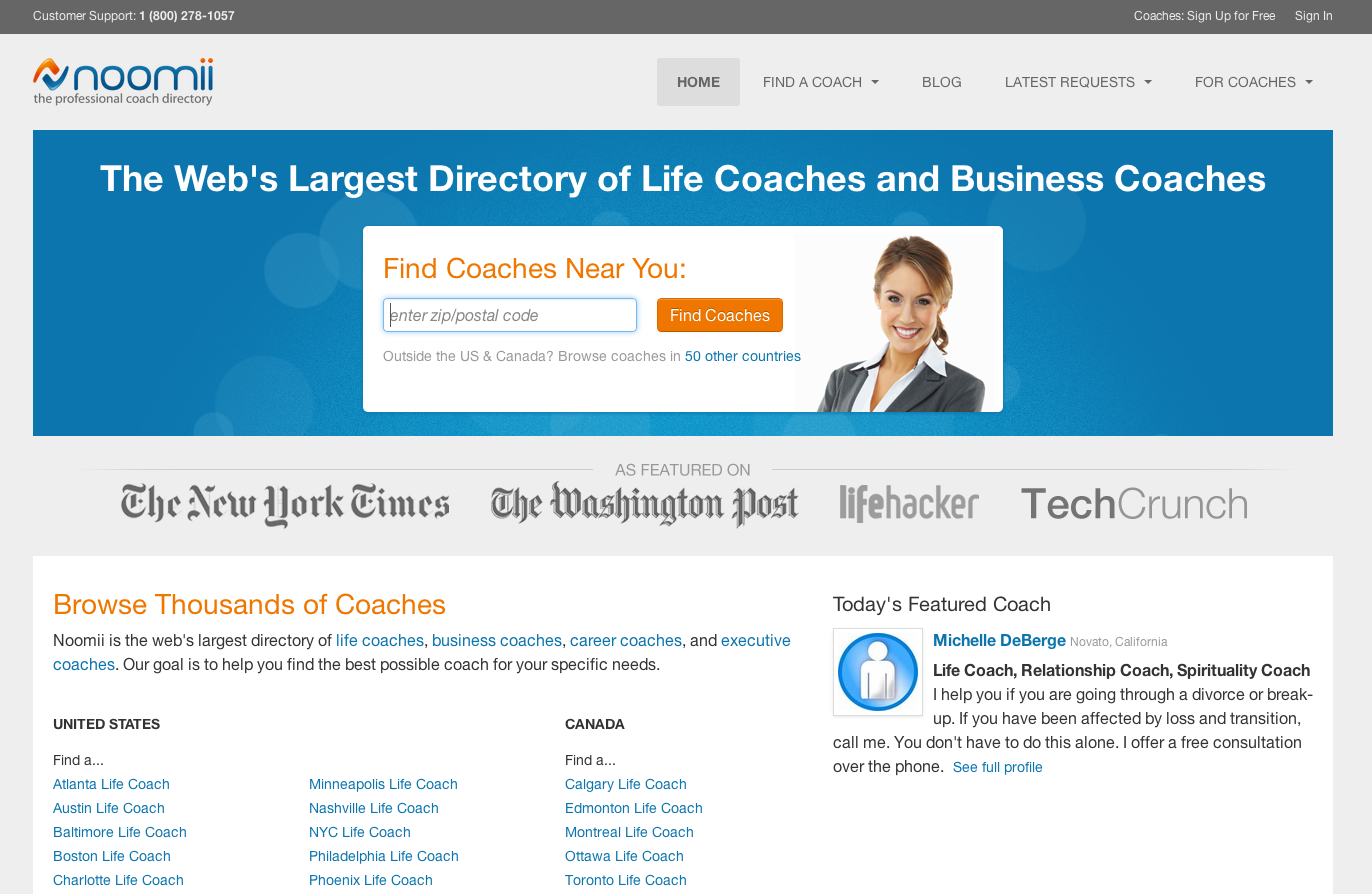
 Our new homepage
Before this redesign, using Noomii on a phone or tablet was a less-than-optimal experience, where nothing fit on the screen and tapping around resulted in more missed clicks than successful requests. One possible solution was to build a smartphone app. We soon realized, however, that clients who visit our site typically only visit a handful of times are not likely to download an app. Another option was to build a mobile-specific site–you know, the version of a site that you can access by pointing your browser to m.cnn.com, for example. But this solution creates a problem with redundant content, and that’s bad for our pagerank and would, ultimately, cost us thousands of potential client visits. We had to keep looking.
This final solution was unanimously agreed on after I pointed the Noomii staff to the beautifully redone Boston Globe website. They were the first major business to implement a fully response website and, at the time, that was a huge risk–and a worthwhile risk. Responsive design is on the cutting edge of web development standards. Most web based businesses have not yet invested in the technology, because an overhaul of their existing systems would cost hundreds of thousands of dollars and countless hours of development time. Many features still need to be fine-tuned for various browsers, and bugs are bound to pop up in unexpected places. For Noomii, however, this option was not only the most elegant solution to the mobile market problem, it was also the most cost-effective solution, aimed at continual improvement of the system we use to unite coaches and clients.
Once the solution was proposed, we strategically chose three important use cases for the redesign: mobile phones, tablets, and laptop/desktop computers. These three different use cases present unique opportunities for Noomii, allowing us to more selectively show information to users depending on where they are browsing from.
Smartphones: Big convenience, small real estate
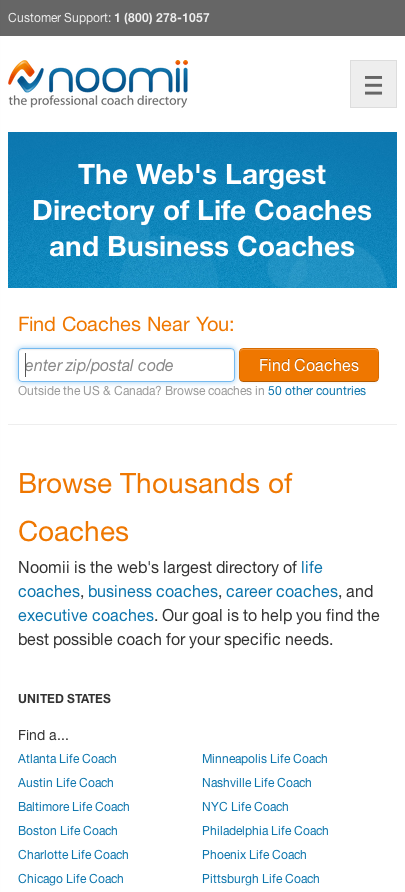
 Homepage view from a mobile phone
Because space and bandwidth can be limited on mobile devices, we’ve made sure there are fewer images and less extra information present when you access Noomii from a phone. Banner ads have been hidden away, menus stored at the bottom of the page, and content you want brought right to the top. For those looking for the perfect example, tap tap tap your way over to the Directory to see the big difference! Coaches, if you’re not on our Premium Plus or Premium plans, now might just be the time to upgrade! Being above the fold for your city on a smartphone could be the one thing that gets you a client over others in your area.
A major reason that people use a smartphone for their web searches is convenience. They want information on the fly so that they can make their decision while running errands or sitting in traffic. Convenience is something that we kept in mind while building the new site, and we’re pleased with the results! Our zip-code search is now at the top of every page, meaning clients can get the information they’re looking for with a single search.
And while we at Noomii certainly appreciate the convenience of searching the web from our phones, we also haven’t forgotten that phones are for phone calls. Coaches, better change your ringtone to We’re In The Money, because every phone number on our site has been optimized to be readable by smartphones, meaning the number listed on your profile page is just a tap away for someone browsing on their phone. Convenience like this means that even those motivationally-challenged clients out there have no excuse when it comes to giving you a call.
Tablets: The Goldilocks Dilemma
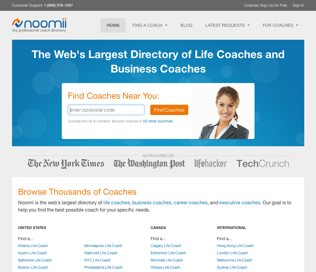
 Tablet view in portrait mode
 Tablet view in landscape mode
Tablets bring us an interesting use case to optimise for. While not as prolific as smartphones, the number of web users ditching their laptops for an iPad and their bookshelves for a Kindle Fire means there is a growing market of casual mobile surfers to plan and design for. The increased accessibility is great, but it comes with some interesting problems to address. We’ve made sure to blend the smart bandwidth conservation techniques of our smartphone breakpoint with a more feature-rich version of the site for users on those gorgeous retina-display tablets.
When users browse our site from a tablet in portrait mode, we’ve maintained a simple single-column layout to keep all the important bits of information uncluttered and unburied. In landscape mode, however, we’re taking advantage of those extra inches of screen width and bringing the user to a layout far more similar to a desktop than a smartphone. By doing this, we hope that we can create a user experience that is not too sparse and not too overburdened, but one that’s just right.
Site-wide Improvements From Our Team of Perfectionists
Okay okay, so maybe you don’t have the latest technological gizmo gadget. Even still, the improvements to Noomii don’t stop with mobile! We’ve done a massive cleanup to the site’s underlying architecture while making the responsive design changes, meaning all our users will enjoy faster page response times, better visibility and legibility, cleaner interfaces, sharper images, and content that has been better tailored to the diverse landscape of internet-capable devices. On laptops and desktops, our efforts really shine through. We’ve stepped away from the cramped 960px wide layout and embraced the widescreen, delivering content specially formatted to fill every inch of your monitor. Our image library and Javascript base has been rebuilt from the ground up, creating a beautiful, feature-rich layout. And as for squinting? Forget it. We’re rocking much bigger font sizes, so you can sit back and relax while browsing through client leads.
And let’s not just focus on the what-you-see. Some of the biggest benefits of the redesign are things you can’t see on our site, but will hopefully see in your inbox! Site redesigns of this scope allow us to more dramatically upgrade and improve our search engine optimization (SEO). We’ve done everything we can to clean up site errors and standardize our content for Google, and with the added responsive features, we should see a pagerank lift in the next few months. Ultimately, all of these changes will help to boost our directory to the top of Google’s search results for every city–from Alaska to Timbuktu!
Looking Forward
Future-proofing a website is impossible, but laying an adaptive framework for all future changes means that we’ll be able to easily scale up with new features. While we’ve spent hours and hours testing the public views of the site, our authenticated portion of the site still requires a little TLC and elbow grease before it’s been polished. Look forward to those changes in the coming weeks.
For anyone on IE8, we hear you. The site currently appears as a far cry from what it used to be, as you’re not able to see the results of our hard work. Responsive design forces us to make decisions about which browsers to support, and IE8 is right on the fence. While IE9+ and all other browsers (such as Firefox, Chrome, and Safari) are able to display the responsive features, IE8 cannot. For those who can upgrade to the latest version of IE, do so! You’ll experience the web with the latest software, and the best security, too! For those who cannot, we’ll be rolling out a stylesheet to help patch the issues you’re experiencing. Ultimately, however, an up-to-date browser is the best solution, so for those on IE7 or earlier, we’re sorry, but we will not be supporting browsers older than IE8.
Conclusion
I hope these months of hard work have paid off and that you’re all loving the new site. For some of you, this change means that waking up and checking the daily leads happens before you get out of bed. For others, that boost in direct phone calls from clients browsing with their phones should brighten your day. For everyone in small cities and towns, our SEO improvements will help lift you and your city from “huh?†to “hired!†For everyone else, we’re always working on ways to continually improve ourselves. If the change you want didn’t make it into this build, it could be rolling out in the next few weeks. Stay tuned!
Now that you’ve heard from us, we’d love to hear from you! What’s the change you’re most excited by? What features will you be taking advantage of, and what are you hoping to see us build into the site in the future? Send us your thoughts in the comments section below!
