Posted on April 20, 2012 by Todd Curzon
 You know the old adage be careful what you ask for, well I decided to follow a recommendation by Noomii co-founder Stephan Wiedner to try out a service called UserTesting.com.  They offer low cost usability testing for websites (in case you’re new to the concept of user testing, I describe how it works at the end of this article).  Going into this experience I thought my website was pretty good and then I got the hard truth. User testing told me I had some challenges in the following areas:
- My homepage lacked a compelling call to action
- The site looked generic with standard fonts and too many words
- User testers couldn’t figure out how to schedule an appointment
- Signing up for the newsletter was buried in obscure menus
Here is my experience with this great service and the “before” and “after” based on the feedback I received.  So you can experience the high quality service they provide I have included video clips of the test execution, tester quotes, and answers to post test impressions.
Perspective #1: My Site Looked too Generic
Overwhelmingly the feedback I received is that my site looked too generic and cookie cutter.  The fonts were standard and it generally lacked the panache to grab the readers attention and encourage them to stay and browse. Watch the video clip and see what you think.
[youtube http://www.youtube.com/watch?v=31vRIhZ-q38?rel=0]
Here are some quotes from the usability testers…
“…The second thing that I noticed was the dark green background, which you find on a number of generic websites…”
“…What strikes me the most about the website is it uses a lot of generic font types…”
“…It has some interesting design elements to it, that is the first thing I notice…the colors are very warm and I personally am not a fan of this type of this type of layout…”
Not all the feedback was focused on the need for improvement.  I also received some kudos.
“It is a very clean looking site, I like the graphics…I get the feeling this is a quality company”
“…This site is very calming…Its got some nice photography and includes everything I would be looking for…”
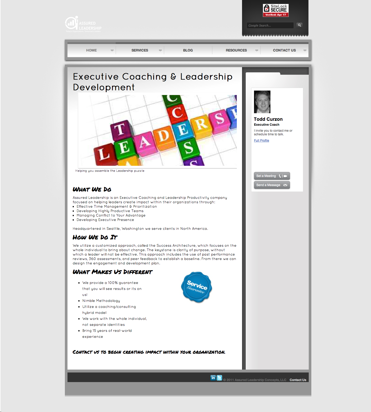
Based on their feedback, here is the revised homepage layout.  I simplified the content, added graphics to capture the readers attention, and added new fonts for a more custom look.  What do you think, was I successful in capturing the essence of the feedback?
After
Perspective #2: Layout Suffers from Information Overload
While information is good, the testers highlighted that there was just simply too many words on the page, not enough pictures, and my site wouldn’t hold the attention of the time starved Executive.  Putting myself in the shoes of my target audience enabled me to redesign the layout to speak more in bullet points and get my point across more succinctly.  I also preserved some of the content to appeal to my other target audience, the HR Manager.
 Perspective #3 Performing Routine Actions
It was really important to me to ensure that visitors to the site could accomplish some very basic tasks including:
- Signing up for a newsletter
- Ask a question
- Schedule an Appointment
As you will see from the video clips I have included, one of the user testers spent a minute trying to locate some of these features, something that would definitely irk a potential client, and turned them off immediately from working with us.
In this video clip the user is attempting to schedule an appointment.  After looking on several pages it becomes clear that there is no clear path to this feature and the only option visible to the potential customer is to send a message.  Definitely not the end result we were looking for.
[youtube http://www.youtube.com/watch?v=-Ibbl37g_ZA?rel=0]
In this video clip the tester is attempting to sign up for the newsletter.  After several failed navigation attempts, the potential customer gives up in frustration without being able to sign up for the newsletter.  Definitely a failure on our part in guiding the user.
[youtube http://www.youtube.com/watch?v=P9ecdEdGqvQ?rel=0]
I spent a good deal of time thinking on how best to “advertise” these features.  I also paid close attention to the navigation that the usability testers attempted when asked to perform these tasks.  The result is a much improved layout, menu structure, and key placement of widgets to prompt the user.
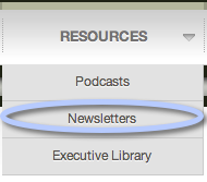
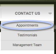
Here is the result of implementing the suggestions from the usability testers.  First I modified the menu structure to better guide the visitor to the right page.  This makes it much easier to find the location to schedule an appointment and sign up for the newsletter.
I updated the resources menu, which is where each of the testers looked when attempting to sign up for the newsletter to actually say Newsletter instead of archives.  In addition we moved the sign-up widget from the home page to this page.
After
I updated the Contact Us menu to include a new menu option titled “Appointments” to make it clear where a customer should go to schedule an appointment.  Much simpler than the first layout.
After
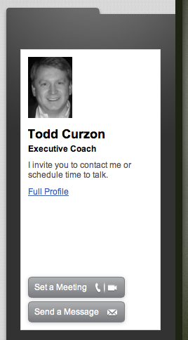
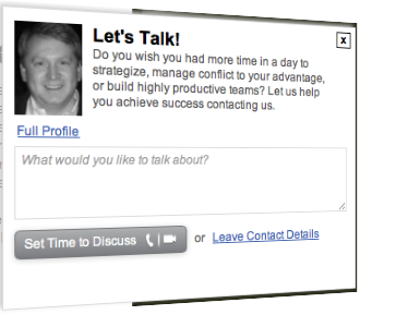
I added some widgets that make it easy to schedule an appointment from the home page and ask a question
In addition to the video capture of the test execution, the tester also answers some questions at the end of their session. ÂÂ
Here is the feedback I received from one of the testers.
- Would you use the www.assuredleadership.com website in the future (please explain why or why not)?I might, but the home page just doesn’t grab you like it should. A few of the others might hold my attention. It is too wordy and doesn’t convey what makes them different.
- If you had a magic wand, how would you improve www.assuredleadership.com?I would take advantage of the actual coach and try to engage visitors with a short video on the home page, more testimonials, a call to action per se. I would also improve the navigation of the site as a few times I had problems following the tasks of the User Test. To me it needs a cleaner navigation approach to try to keep people from having to search for things. The design of the site should really attempt to convey what the Company is about without so many words. Do it with graphics and pictures and video.
- What did you like about www.assuredleadership.com?I like the large amount of resources, ie. the podcasts, book section, community section etc. The company definitely presents a wealth of resources for those individuals who want to improve.
- How likely are you to recommend www.assuredleadership.com to a friend or colleague (0=Not at all likely, and 10=Very Likely)?5 If someone was asking me for help finding executive coaching I would likely mention the site. But I wouldn’t enthusiastically mention it to a friend in a conversation raving about how great it was.
I still would like to add an audio intro telling more about what Assured Leadership does.
Without a doubt, UserTesting.com improved the overall layout, flow, and design of my website.  I would definitely recommend this service to others looking for a customer perspective.  Sometimes as the creator we can get too close to the end product to remain objective.  I invite you to give UserTesting.com a try and see what they can do for you.
So you sign up for an account, which is quick and easy and then you design your test.  You can start from scratch or use one of their templates, which you can further customize.  You select the number of users and any number of tasks and questions you would like the tester to complete.  I found their large database of suggested tasks quite useful
Next you define the parameters of your user testing population.  They enable you to select from the following criteria:
- Gender
- Age
- Income
- Country
- Expertise with the Web
- Custom Requirements (Comments Field)
You submit your request and then your test is picked up.  I signed up for four testers and within 15 minutes all the spaces were filled.
I invite you to try this service and share your experiences.

