Posted on June 15, 2011 by Stephan Wiedner
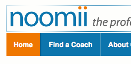
It’s been months in the making. Today, we are excited about showing off our new look.
 More Appeal for Business Clients
Our goal is to be the web’s #1 destination for people looking for life coaches and business coaches. Customer feedback indicates that the new logo and colors are appealing for both. Know what that means? More client leads.
 Waaaaay Faster Load Times
We’ve thrown out the old clunker and replaced it with a speedster. A faster loading website leads to a better user experience which leads to better Google rankings. What does that mean for you? More client leads.
 Cleaner, Simpler Navigation
We’ve spent a lot of time watching user testers fumble around the site, not able to find what they are looking for. The new navigation should make life a lot easier for those kinds of people. And you know what that means! More client leads.
There’s one caveat, the old colors still exist when you are logged into Noomii. This is temporary and we’re sorry if this causes any confusion.
Like what you see? Please leave your comments and feedback below.

These are really wonderful enhancements Stephan. I look forward to see how this will positively impact the site by way of client and coach usage as well reporting.
Thanks Kelly. We’ll be monitoring it closely. We’re already making improvements and changes to ensure that we are generating the user engagement that we want.